Radio Group Control
Use a radio group control to force the agent to select just one of multiple options.
A radio group control is a set of labeled radio buttons of which the agent can select just one.
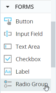
The radio group control is located under Forms in the control menu.
Rename the Options
After adding a radio group to a callout, select each radio button label and specify its text in the Content field.
Add Additional Options
To add additional options to the radio group, click an existing option and then click  .
.
The new option is added below the option you selected.
Remove an Option
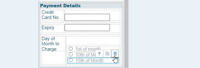
To remove an option, select the option in the callout and click the Delete button.
Set a Default Selection
Optionally, choose which radio button should be selected by default when the callout is displayed.
Select the radio group and choose which radio button to select from the Selected drop-down.
Read the Selection During Run-Time
Your solution can read and react to changes in the radio group selection during run-time.
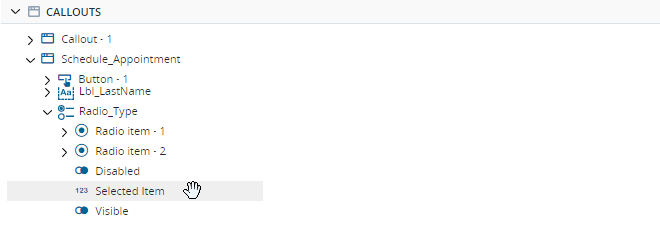
The radio group's Selected Item property indicates which option is currently selected. It returns a number value. For example, if the second radio button in the group is selected, Selected Item will be set to 2.
Example
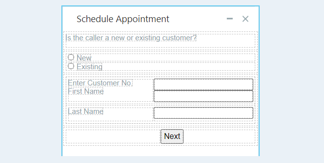
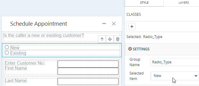
This example demonstrates how to create a callout as shown below. Note that when the agent changes the selection in the radio group, other controls are automatically hidden or displayed.
The callout includes labels and text input areas for Customer No., First Name, and Last Name.
The callout must work as follows:
-
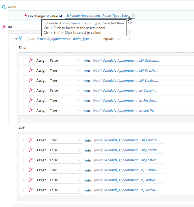
When New is selected, only the Customer No. label and text input area must visible.
-
When Existing is selected, only the First Name and Last Name labels and text input areas must be visible.
To set the default selection to New, Selected Item must be set to New.
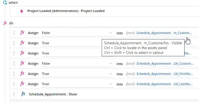
The event handler below is triggered when the project loads.
When this event handler is triggered:
- The labels and text input areas for Enter Customer No. are made invisible (Visible property is set to False).
- The labels and text input areas for First Name and Last Name are made visible (Visible set to True).
- The callout is displayed.
A second event handler is triggered when the Selected property of the radio group changes. When this event handler is triggered, the appropriate labels and text input areas are made visible or invisible.


