Tooltip Control
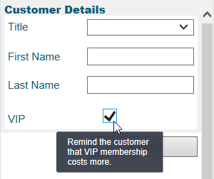
Use the Tooltip control to display helpful text when the agent rolls over another control.
The tooltip control is located under Extra in the control menu.

Tooltip Style
By default, tooltips are displayed with styling. If your browser does not support styled tooltips, you can use a Plain tooltip, that is displayed with no styling.
To configure a tooltip's style:
- Select the tooltip control on the callout.
- On the SETTINGS panel, under TOOLTIP MODE, select Styled or Plain.
Add a Tooltip
To add a tooltip to a control, you must place the control inside the tooltip control. You can create the two controls in either order. However, it is easier to select and configure the tooltip before you place the control inside it.
- Drag a tooltip control onto the callout.
- Enter the text to display in the Text field in the Style panel.
- Specify where the text will display using the Position setting.
- Specify the size of the tooltip using the Length setting.
- Drag the other control into the tooltip control.
Note that the Visible option makes the tooltip visible in design mode only. This option has no effect during run-time.


