Button Control
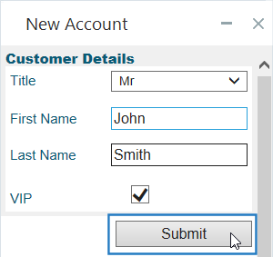
Use the Button control to add a button to a callout. You can then specify the actions that must be performed when the button is clicked.
You can set the default text to be displayed on the button, and can also modify that text dynamically during run-time.
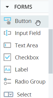
The Button control is located under Forms in the control menu.
Set the Button Text
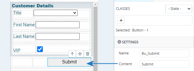
To set the default text displayed on the button, enter the text in the Content field in the Style panel.
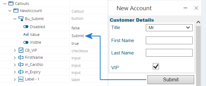
The button's Value property sets the text displayed on the button. When the solution first loads, the Value property is set to the text specified in the Content field in the Style panel.
You can modify the text on the button dynamically during run-time by modifying the value of the Value property. The action below modifies the button text to Verify.
Define the Button Actions
To specify the actions to perform when the button is clicked, you must add an event handler for the button control.
-
Select the button control.
-
Click the Control Actions tab to display the Builder area.
-
Drag functions or other assets from the Assets Panel into the Builder area, as for workflows.
When the button is pressed during run-time, those actions will be performed. In the example shown, the AddAccount workflow is started.
Copy and Paste Actions
You can copy and paste actions within, and between the following assets:
- Steps
- Worklfows
- User-Defined Functions
- Transitions
- Triggers
- Callout control actions
- If statements
To copy an action, right-click the action > Copy.
To paste an action, right-click the action Builder > Paste.


