

IBA Screen Element Assets
This section presents IBA screen element assets, including methods, properties, and events.
Each IBA element and frame has its own assets - properties, methods, and events. These are listed in the Assets Panel.
For example, the assets provided for an IBA button element are shown below.
 Show example
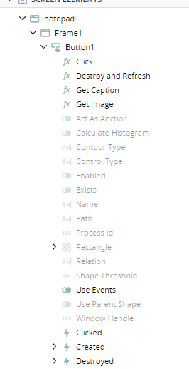
To learn about capturing and managing IBA screen elements, see IBA Elements.
To learn about the elements for standard screen elements, see Screen Element Assets.
The tables below list the methods, properties, and events provided for the IBA elements. Not all assets are available or relevant for all element types: the tables indicate for which types each asset is relevant.
Methods
|
Asset |
Description |
Relevant For |
|---|---|---|
| Append Text | Add text to the text box at the cursor position. | TextBox |
| Click | Click on the element. | Button, General, Link |
| Copy | Copy the text in the element to the clipboard. | Combobox, General, TextBox |
| Destroy and Refresh | Validate all objects from the selected element downward in the hierarchy. The process destroys any objects that no longer exist. |
Button, Checkbox, Combobox, General, Link, Listbox, RadioButton, ScrollBar, TabBar, TextBox, TreeView |
| Get Caption | Return the text on the element. | Button |
| Get Image | Save an image of the element to an Advanced Picture Object. | Checkbox, Combobox, General, Link, Listbox, RadioButton , ScrollBar, TabBar, TextBox, TreeView |
| Get Node Text | Return the text on the node specified by index using OCR. | TreeView |
| Get Selected Node Text | Return the text on the selected node using OCR. | TreeView |
|
Get Picture |
Save an image of the element to an Advanced Picture Object. | Button Checkbox |
| Get Selected Rectangle | Return the rectangle of the selected item as a Screen Element Rectangle type that specifies the size and location of a rectangle on the screen. | Listbox |
| Get Selected Text | Return the text of the selected item, identified using OCR. | Listbox |
| Get Tab Image | Return an image of the tab specified by index as an Advanced Picture Object. | TabBar |
| Get Tab Text | Return the text on the tab specified by index, read using OCR. | TabBar |
| Get Text | Return the text on the element. | Checkbox, Combobox, General, Link, RadioButton, TextBox |
| Mouse Action | Simulate a mouse action, such as a click, on the control. From the Action dropdown list, select the type of action to emulate. From the Parameter dropdown list, specify where to perform the mouse action on the general control. If you use X and Y offsets to specify where to perform the mouse action, use the Offset field to define the applicable values. | General, Listbox |
| Paste | Paste text from the clipboard into the element. | Combobox, General, TextBox |
| Scroll |
Perform a specified action using the scrollbar. Actions include: Bottom, Page Down, Page Up, Scroll Down, Scroll Up, Top |
General, ScrollBar
|
| Select Item | Select an item by text. | Combobox, Listbox |
| Select Item by Index | Select an item by its index number in the list. | Combobox, Listbox |
| Select Node by Text | Select a node by specifying its text. | TreeView |
| Select Node by Index | Select a node by specifying its index. | TreeView |
| Select Tab | Select a tab by specifying the text on the tab. Text is recognized using OCR. | TabText |
| Select Tab by Index | Select a tab by specifying its index. | TabText |
| Send Keys | General, TextBox | |
| Set Text | Set the text in the text box. | TextBox |
| Set Text Extended |
Delete any existing text and then inserts text in to the text box. Use the text parameter to specify the text you want to insert, and the deleteTextType to specify the method for deleting existing text: 0: {CTRL}a{DEL} 1: {CTRL}{SHIFT}{HOME}{CTRL}{SHIFT}{END}{DEL} |
TextBox |
Properties
|
Asset |
Type |
Read/Write |
Description |
Relevant For |
|---|---|---|---|---|
| Act as Anchor | Boolean | Read-only | Indicates if the element is used as an anchor. | Button, Checkbox, Combobox, General, Link, Listbox, RadioButton, ScrollBar, TabBar, TextBox, TreeView |
| Appears On Mouse Over | Boolean | Ready-Only | Indicates if the element only displays when the mouse hovers over the space it occupies (True), or whether it is always visible (False). | ScrollBar |
| Button Left Position | Boolean | Read-Only | Position of the combo box button (drop-down arrow). False: The button is to the right of the combo box. True: The button is to the left of the combo box. | Checkbox |
| Calculate Histogram | Boolean | Read-only | Returns True if identification is based on color distribution. | Button, Checkbox, Checkbox, General, Link, Listbox, RadioButton, TabBar, TextBox, TreeView |
| Check Mark Left Position | Number | Read-only | Defines whether the checkbox is selected by default. | Checkbox, RadioButton |
| Checked | Boolean | Read/Write | Indicates whether the checkbox is checked or not. | Checkbox, RadioButton |
| Contour Type | Text | Read-only | Indicates whether the shape is Shape Recognized or Owner Drawn. | Button, Checkbox, Checkbox, General, Link, Listbox, RadioButton, ScrollBar, TabBar, TextBox, TreeView |
| Control Type | Text | Read-only | Type of control. | Button, Checkbox, Checkbox, General, Link, Listbox, RadioButton, ScrollBar, TabBar, TextBox, TreeView |
| Dark Thumb | Boolean | Read-Only | Indicates whether the scrollbar handle is darker than the scrollbar track (True) or lighter (False) | ScrollBar |
| Enabled | Boolean | Read-only | The initial state of the control. True if the control is enabled in its initial state, or False if the control is disabled in its initial state. | Button |
| Exists | Boolean | Read-only | True if the element currently exists or False if it doesn't. | Button, Checkbox, Checkbox, General, Link, Listbox, RadioButton, ScrollBar, TabBar, TextBox, TreeView |
| Has Button | Boolean | Read-Only | True if the shape of the element includes a button. | Combobox |
| Has Icon | Boolean | Read-Only | True if each element has an icon. | TreeView |
| Has Scroll Popup Menu | Boolean | Read-Only | Indicates whether the scrollbar has a right-click menu (True) or not (False). | ScrollBar |
| Has Selection Background | Boolean | Read-Only | Indicates if the selected tab has a colored background (True) or not (False). | |
| Is Editable | Boolean | Read-Only |
True if you can type directly into the combobox to jump to a value, False if you can't. |
Combobox |
| Minimum Perimeter of Selection | Number | Read-Only | The minimum size of the perimeter for the shape. | Listbox |
| Multiline | Boolean | Read-Only | Indicates if the control supports multi-line entry | TextBox |
| Name | Text | Read-only | Name of the control. | Button, Checkbox, Checkbox, General, Link, Listbox, RadioButton, ScrollBar, TabBar, TextBox, TreeView |
| Path | Text | Read-only | Position in the captured frame. This is an internal value used for advanced debugging. | Button, Checkbox, Checkbox, General, Link, Listbox, RadioButton, ScrollBar, TabBar, TextBox, TreeView |
| Process Id | Number | Read-only | Button, Checkbox, Checkbox, General, Link, Listbox, RadioButton, ScrollBar, TabBar, TextBox, TreeView | |
| Rectangle | Number | Read-only | The shape boundaries. | Button, Checkbox, Checkbox, General, Link, Listbox, RadioButton, ScrollBar, TabBar, TextBox, TreeView |
| Relation | Text | Read-only | The anchor used for identification of the element. | Button, Checkbox, Checkbox, General, Listbox, RadioButton, ScrollBar, TabBar, TextBox, TreeView |
| Right to Left | Boolean | Read-Only | True if text direction is from right to left. | TreeView |
| Rows | Number | Read-Only | The number of rows of tabs in the tab bar. | TabBar |
| Same Size | Boolean | Read-Only | Indicates if the tabs have the same width (True) or not (False). | TabBar |
| Selected Index | Number | Read-Only | The index of the selected tab. | TabBar |
| Scroll Method | Text | Read-Only | Indicates whether element scrolls by Line or by Page. | Combobox, Listbox |
| Scrolling Type | Text | Read-Only | Indicates whether the scrollbar is Vertical or Horizontal. | ScrollBar |
| Shape Threshold | Decimal | Read-only | The recognition threshold for the anchor. | Button, Checkbox, General, Link, Listbox, RadioButton, ScrollBar, TabBar, TextBox, TreeView |
| Suppress Background | Boolean | Read-Only | True if only the text was captured. False if the text and its background were captured. | TreeView |
| Tabs Count | Number | Read-Only | The number of tabs in the tab bar. | TabBar |
| Use Events | Boolean | Read/Write | Specify whether the solution should monitor the control for events (True) or not (False). | Button, Checkbox, Combobox, General, Link, Listbox, RadioButton, ScrollBar, TabBar, TextBox, TreeView |
| Use Parent Shape | Boolean | Read-only | The parent shape is searched instead of the entire frame. | Button, Checkbox, Combobox, General, Link, Listbox, RadioButton, ScrollBar, TabBar, TextBox, TreeView |
| Window Handle | Number | Read-only | Button, Checkbox, Combobox, General, Link, Listbox, RadioButton, ScrollBar, TabBar, TextBox, TreeView |
Events
|
Asset |
Description |
Relevant For |
|---|---|---|
| Checked | The element was checked. | Checkbox, RadioButton |
| Clicked | The element was clicked. | Button, Link |
| Created | The element was created. | Button, Checkbox, Combobox, General, Link, Listbox, RadioButton, ScrollBar, TabBar, TextBox, TreeView |
| Destroyed | The element was destroyed. | Button, Checkbox, Combobox, General, Link, Listbox, RadioButton, ScrollBar, TabBar, TextBox, TreeView |
| Unchecked | The element was unchecked. | Checkbox, RadioButton |
| Item Selected | An item was selected from a list. | Combobox, Listbox |
| Mouse Clicked | A left-click was performed on the element. | General |
| Node Selected | A node in the tree view was selected. | TreeView |
| Tab Selected | A tab in the tab bar was selected. | TabBar |
| Text Changed | The text in the element changed | TextBox |