Best Practices for Callouts
This topic provides best practices to apply when working with callouts.
For more information on working with callouts, see Callouts.
 Download the Callout Design Best Practice Guide
Download the Callout Design Best Practice Guide here.
This guide provides extensive recommendations for ensuring that your callouts are effective and attractive.
 Choosing a Callout Type
Automation Studio provides three types of callouts:
-
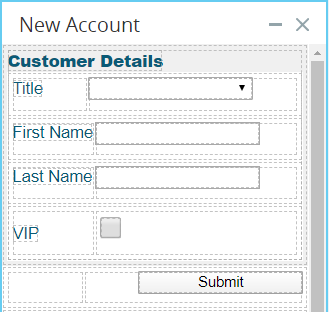
Grid: In this mode, the location of controls on the callout is specified using standard HTML/CSS display properties. The 1 Column, 2 Column, and Table controls allow you to construct a grid in which to place other controls to achieve the desired layout. This is the default mode.
-
Freeform: In this mode, simply drag each control to the desired position on the callout. The 1 Column, 2 Column, and Table controls are not available in this mode.
-
HTML Callout: In this mode, you can use the HTML-based widget to build a callout using HTML, CSS, and JavaScript code. This will give the developers maximum control over callout appearance and behavior. For more information, see HTML Callout.
Freeform callouts are recommended for demonstration and proof-of-concept purposes. They allow you to create a functional callout quickly and without special design skills.
Grid callouts are recommended for professional designers and for production-ready callouts. The high level of control these callouts provide allows you to create high-end callouts that perfectly locate multiple callout controls in complex configurations.
 Creating and Formatting Callouts
-
The recommended naming convention for a callout is Upper camelCase, for example, AddAccount and SalesScript.
-
Apply appropriate formatting to messages, including error messages, completion messages, and system notifications.
-
Ensure consistency in formatting: callouts of the same type should be identically formatted, while all callouts in the solution should share a consistent look and feel.
-
When requesting the user to make a decision, present all information needed when a decision is to be made. Do not require the user to remember information presented on other screens when asking for a decision.
-
When showing a warning or error message, provide as much context as possible. Depending on the situation, include information on what the user was attempting to do, what went wrong and why, what the user has to do next, or what is going to happen next.
-
Confirmation messages should restate what action was requested and completed.
-
Csíkszentmihályi's theory of Flow as a mental state as it applies to interface design to provide the user with an experience of flow.
-
Fitt's Law, which, when applied to interface design, suggests that clickable areas should be as large as possible. For example, the label of a radio button should itself be clickable.
-
Weber's Law, which, when applied to interface design, suggests that on-screen elements should be contrasted in proportion to the differences between them. For example, message colors should generally be similar, but error messages should look significantly different.
-
Gestalt Principles of Grouping, which can be applied to the design and positioning of callout controls and of callouts themselves.
-
Miller’s Law of Short-Term Memory Load, which when applied to interface design, suggests that the interface should not rely on the user remembering information but should rather present all required information at every stage.
-
Hick’s Law, which deals with the time required for decision making and when applied to interface design, suggests that a process should be broken down into smaller steps and that the range of options available to the user at each step be limited, and that the suggested option be indicated.
 Adding and Formatting Callout Controls
This section is applicable for Grid and Freeform callouts only.
-
Ensure a consistent look and feel across all callouts and callout controls.
-
Apply formatting to various states of buttons and other controls, as relevant. Stronger visual queues should be used for significant state changes, more gentle visual queues should be used for more subtle state changes. States that should be clearly indicated by design include hover, selected, and error.
-
Related controls should be visibly grouped together, for example, text entry fields for Street, City, and Country should be grouped as together they specify an address.
-
Use grids to align controls. Consider using alternating row colors.
-
The labels for checkboxes and radio buttons must also be clickable to enlarge the clickable area.
-
The label of a callout control should be located as close to the control as possible, and it should be clear to which control the label applies.
-
Place the label of a control above the control if there is enough vertical space to do so. If vertical space is insufficient, labels should be right-aligned to the left of the control.
-
Labels for checkboxes and radio buttons should generally be to the right of the control. In some cases, such as rating questions in surveys, the label should be placed to the left of a series of radio buttons.
-
Vertical alignment of text, graphics, and controls comprising a line/row should be by the baseline of the first line of text (if there is wrapping).
-
Dialog buttons at the bottom of a dialog should be right-aligned.
-
In a grid/table:
-
The header text of a column should be aligned in the same way as the contents of the column.
-
Text columns should be left-aligned.
-
Numeric columns should be right-aligned.
-
-
Page, dialog, and section titles should all be left-aligned.
-
Actions associated with checked items in a grid should appear close to the column of check boxes
-
Csíkszentmihályi's theory of Flow as a mental state as it applies to interface design to provide the user with an experience of flow.
-
Fitt's Law, which, when applied to interface design, suggests that clickable areas should be as large as possible. For example, the label of a radio button should itself be clickable.
-
Weber's Law, which, when applied to interface design, suggests that on-screen elements should be contrasted in proportion to the differences between them. For example, message colors should generally be similar, but error messages should look significantly different.
-
Gestalt Principles of Grouping, which can be applied to the design and positioning of callout controls and of callouts themselves.
-
Miller’s Law of Short-Term Memory Load, which when applied to interface design, suggests that the interface should not rely on the user remembering information but should rather present all required information at every stage.
-
Hick’s Law, which deals with the time required for decision making and when applied to interface design, suggests that a process should be broken down into smaller steps and that the range of options available to the user at each step be limited, and that the suggested option be indicated.


