

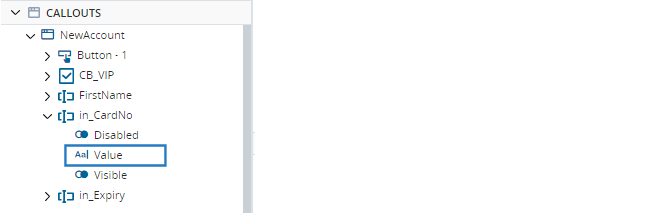
Input Field Control
Use the Input Field control to allow the agent to enter free text. You can enter placeholder text to show initially, and can also specify the type of input expected.
 View image
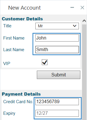
Note that the text label for each input field is not part of the input field control. You must add a separate label control to display that text.
If a significant amount of text is expected, use the Text Area control instead.
The Input Field control is located under Forms in the control menu.
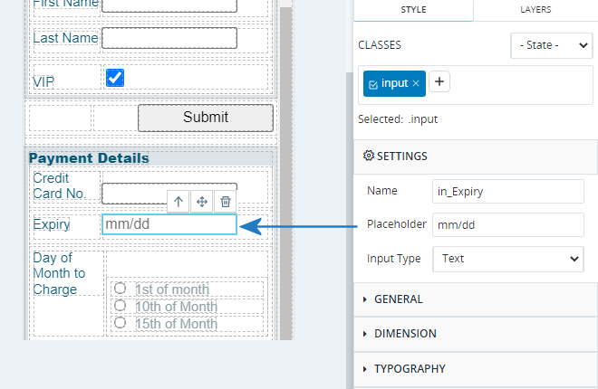
Set Placeholder Text
You can set text to display initially in the input field. Doing so does not set the actual value of the field.
Select the input field and enter text in the Placeholder field in the Style panel.
Specify the Input Type
You can specify the type of input expected from the Input Type field in the Style panel.
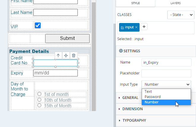
The available types are:
- Text: The agent can enter any text. The text is displayed normally.
- Password: The agent can enter any text. Asterisks are displayed instead of the text entered.
- Number: The agent can only enter numbers 0-9 and the decimal point, for example, 19.99. If any other character is entered, the field will be cleared.
Read the Entered Value
The value entered into the input field is stored in the input field's Value property.
Note that the Value property is of type Text, regardless of the Input Type set in the Style panel - the Input Type setting only affects the display and behavior of the input field.
Example
A callout is initially displayed as below. Note that the Expiry input field is populated with placeholder text. Note though that the Value property shown in the Debug panel is blank - placeholder text does not set the Value property.
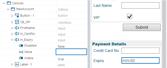
When the agent enters text in Expiry input field, the control's Value property is updated.
