

Add and Customize Callout Controls
This section is applicable for Grid and Freeform callouts only.
You can add any number of any of the available callout controls to a callout. Once a control has been added to a callout, you can:
-
Style the control
-
Rename the control
-
Delete the control
-
Reposition the control
-
Duplicate the control
-
Add an event handler for the control
Add a Control to a Callout
-
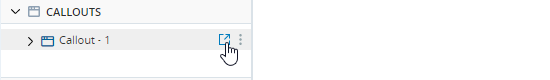
Open the callout from the Assets Panel if not already open.
-
Drag the required control into the callout and drop it at the required location.
-
Edit or customize the control. See here - a separate topic provides instructions on how each control type can be customized.
Style a Control
After adding a control to a callout you can:
-
Change its position within the callout
-
Change its size
-
Change its appearance, for example, its color or shadow
-
Specify the text to be displayed in the control, where relevant
-
Assign classes to the control (see Use Callout Classes)
If you add styling to a control with a class assigned to it, you can add the styling to the class by clicking Sync  , found on the Style Panel, next to the class. The styling is added to all controls in the callout using the class.
All the appearance settings are based on standard CSS properties. For information on these, consult external resources, for example, https://www.w3schools.com/css/.
To style a callout:
-
Open the callout from the Assets Panel if not already open.
-
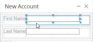
Select the control to customize.
-
In the Style panel at the right, select which state of the control you want to customize, or leave it as -State- to customize the control's default appearance.
When you select a state, the control is displayed according to the settings for the state you select.
-
Select the classes to assign the control.
-
Customize the control in the Style panel using the settings below:
Group
Setting
Description
Settings Name
The name of the control
Content
The text to display on the control
(Other Settings Relevant to the Control Type) See separate topics for each control type listed here.
General CSS properties for controlling the position of the control in the callout Dimension CSS properties for controlling the size of the control Typography CSS properties for controlling the appearance of the text in the control
Decorations CSS properties for customizing the control's background and borders
Note: A background image can be specified. However, animated gif files are not supported. See Add and Customize Callout Controls.
Extra CSS properties for scaling and rotating the control
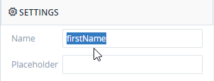
Rename a Control
A control is assigned a default name when created. You can edit that name but the name must be unique in the project. If you enter a name of an existing control, or if you empty the field, the field value will be reset to its previous value.
To rename a callout control:
-
Open the callout from the Assets Panel if not already open.
-
Select the control to rename.
-
In the Style pane, under Settings, enter the new name for the control in the Name field.
Delete a Control
You can delete a callout control.
To delete a callout control:
-
Open the callout from the Assets Panel if not already open.
-
Select the control and click the Delete button
 .
. -
If:
-
The callout control has not been referenced in the project, the control will be deleted
-
The callout control has been referenced in the project, you will be notified.
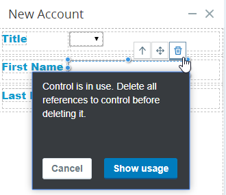
Click:
- Cancel if you decide not to delete the control.
- Delete Anyway to delete the control. All references to the control and its properties will be removed from the project.
-
Show Usage to open the Usage Reference Panel
-
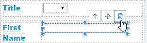
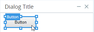
Reposition a Control
-
Open the callout from the Assets Panel if not already open.
-
Select the control to move and click the move button
 .
. -
Drag the control to its new position and release. (Click image to play)
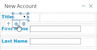
Duplicate a Control
You can duplicate a control located on a callout. Duplicating a control includes all the Control Actions associated with the control.
-
Open the callout from the Assets Panel if not already open.
-
Select the control, and click the duplicate button
 .
.
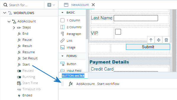
Create Event Handlers for Controls
You can specify the actions to perform whenever an agent interacts with a callout control, directly within the callout editor.
For example, you can specify the actions to perform when a button is clicked.
The full list of supported events is shown below:
|
callout Control Type |
Event |
|---|---|
| Button |
On Click |
| Checkbox | On Change |
| Input Field |
On Change |
| Text Area | On Key Up |
| Radio Group | On Change |
| Select |
On Change |
To specify the actions to perform when an event occurs:
-
Open the callout from the Assets Panel if not already open.
-
Select the relevant control.
-
Click the Control Actions tab to display the Builder area.
A Builder area tab labeled with the type of the control and the event type is displayed.
If you select a control for which no events are supported, for example a label, you will not be able to add actions to the Builder area.
-
Drag functions or other assets from the Assets Panel into the Builder area, as for workflows.
Best Practices
 Formatting of Callout Controls
-
Ensure a consistent look and feel across all callouts and callout controls.
-
Apply formatting to various states of buttons and other controls, as relevant. Stronger visual queues should be used for significant state changes, more gentle visual queues should be used for more subtle state changes. States that should be clearly indicated by design include hover, selected, and error.
-
Related controls should be visibly grouped together, for example, text entry fields for Street, City, and Country should be grouped as together they specify an address.
-
Use grids to align controls. Consider using alternating row colors.
-
The labels for checkboxes and radio buttons must also be clickable to enlarge the clickable area.
Placement of Control Labels
-
The label of a callout control should be located as close to the control as possible, and it should be clear to which control the label applies.
-
Place the label of a control above the control if there is enough vertical space to do so. If vertical space is insufficient, labels should be right-aligned to the left of the control.
-
Labels for checkboxes and radio buttons should generally be to the right of the control. In some cases, such as rating questions in surveys, the label should be placed to the left of a series of radio buttons.
Alignment
-
Vertical alignment of text, graphics, and controls comprising a line/row should be by the baseline of the first line of text (if there is wrapping).
-
Dialog buttons at the bottom of a dialog should be right-aligned.
-
In a grid/table:
-
The header text of a column should be aligned in the same way as the contents of the column.
-
Text columns should be left-aligned.
-
Numeric columns should be right-aligned.
-
-
Page, dialog, and section titles should all be left-aligned.
-
Actions associated with checked items in a grid should appear close to the column of check boxes
Topics for Suggested Further Reading
-
Csíkszentmihályi's theory of Flow as a mental state as it applies to interface design to provide the user with an experience of flow.
-
Fitt's Law, which, when applied to interface design, suggests that clickable areas should be as large as possible. For example, the label of a radio button should itself be clickable.
-
Weber's Law, which, when applied to interface design, suggests that on-screen elements should be contrasted in proportion to the differences between them. For example, message colors should generally be similar, but error messages should look significantly different.
-
Gestalt Principles of Grouping, which can be applied to the design and positioning of callout controls and of callouts themselves.
-
Miller’s Law of Short-Term Memory Load, which when applied to interface design, suggests that the interface should not rely on the user remembering information but should rather present all required information at every stage.
-
Hick’s Law, which deals with the time required for decision making and when applied to interface design, suggests that a process should be broken down into smaller steps and that the range of options available to the user at each step be limited, and that the suggested option be indicated.