Callout Control Types
This section is applicable for Grid and Freeform callouts only.
Use callout controls to display information to the agent and to collect information from the agent.
The following control types can be added to a callout:
Basic
|
control |
Description |
Example |
|---|---|---|
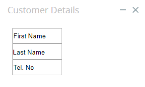
| 1 Column |
Creates a single column to help the designer arrange elements within the callout. Only available in Grid mode. |
|
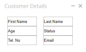
| 2 Column |
Creates 2 parallel columns to help the designer arrange elements within the callout. Only available in Grid mode. |
|
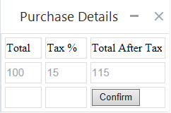
| Table |
Display static or dynamic data in a table. Only available in Grid mode. |
|
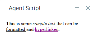
| Display formatted text. |
|
|
| Link | Display hyperlinked text that opens a specified URL in the same window or in a new window when clicked. |

|
| Image |
Display an image. Use a built-in Neva image, upload an image from your PC, or embed an image from the Internet with its URL. |
|
Forms
|
control |
Description |
Example |
|---|---|---|
| Button |
Provide a button that the agent can click to perform one or more actions. |

|
| Input Field |
A field into which the agent enters text. |

|
| Text Area |
A field into which the agent enters text. Allows multiple lines of text to be entered and displays a vertical scroller when required. |

|
| Checkbox |
A checkbox that can be checked or cleared. |

|
| Label |
Text specified by the developer for display in the callout. The text can be either static or dynamic. |

|
| Radio Group |
A set of labeled radio buttons of which the agent can select just one. |
|
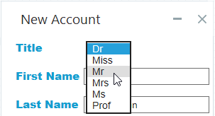
| Select |
A list of predefined options from which the agent can select just one. |
|
Extra
|
control |
Description |
Example |
|---|---|---|
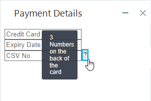
| Tooltip | Display a text tooltip when the agent rolls their cursor over a specified area of the callout. |
|
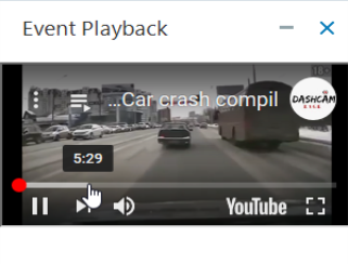
| Video | Display a video. Videos can be sourced from YouTube, Vimeo, or an HTML5 source. Multiple playback and control options are provided. |
|
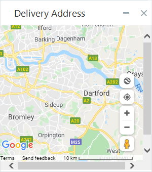
| Map | Display a Google road or satellite map focused at a specified address at a specified zoom level. |
|


